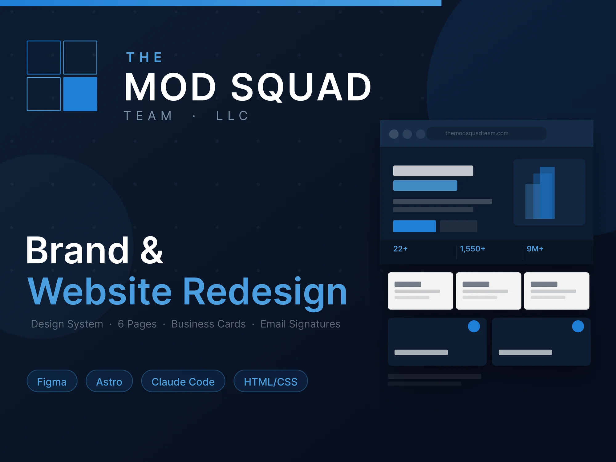
The Problem
The old site had good content, but it was buried.
- No Visual Identity: No set colors or fonts meant the brand felt disconnected.
- Bad Hierarchy: Text was just dropped in blocks, making it hard to find key info.
- Confusing Structure: They were mixing services and portfolio projects on the same page.
- Missing Pieces: No dedicated place for investors or a structured way to showcase their work.
The Process
1. Logo & Identity
The new logo is a direct nod to modular building. I designed a geometric mark that looks like construction modules coming together. It's clean, precise, and works perfectly on everything from a dark-themed website to a business card.

2. Design System First
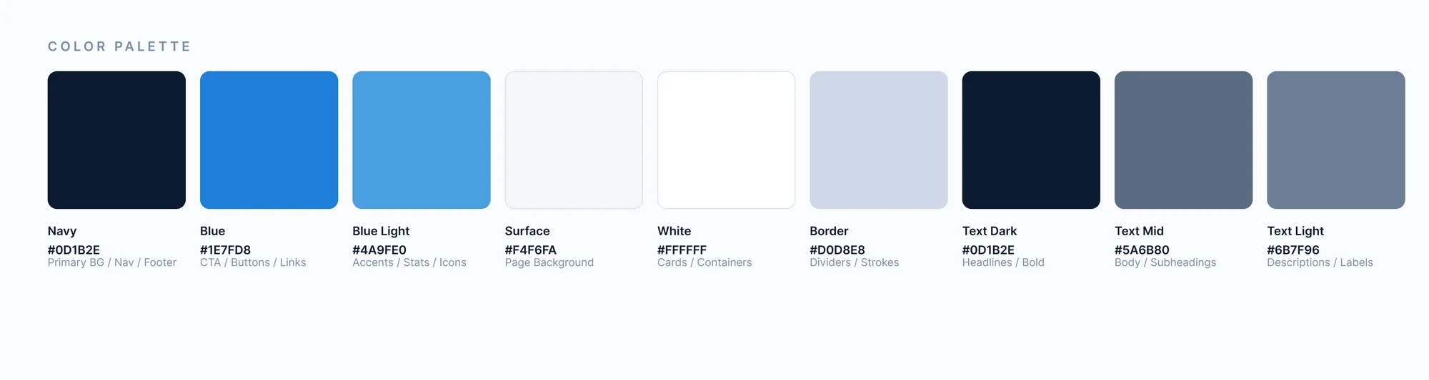
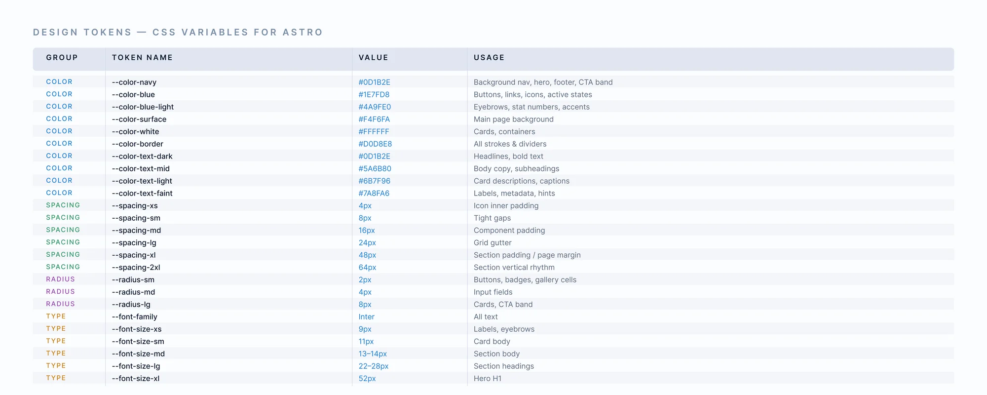
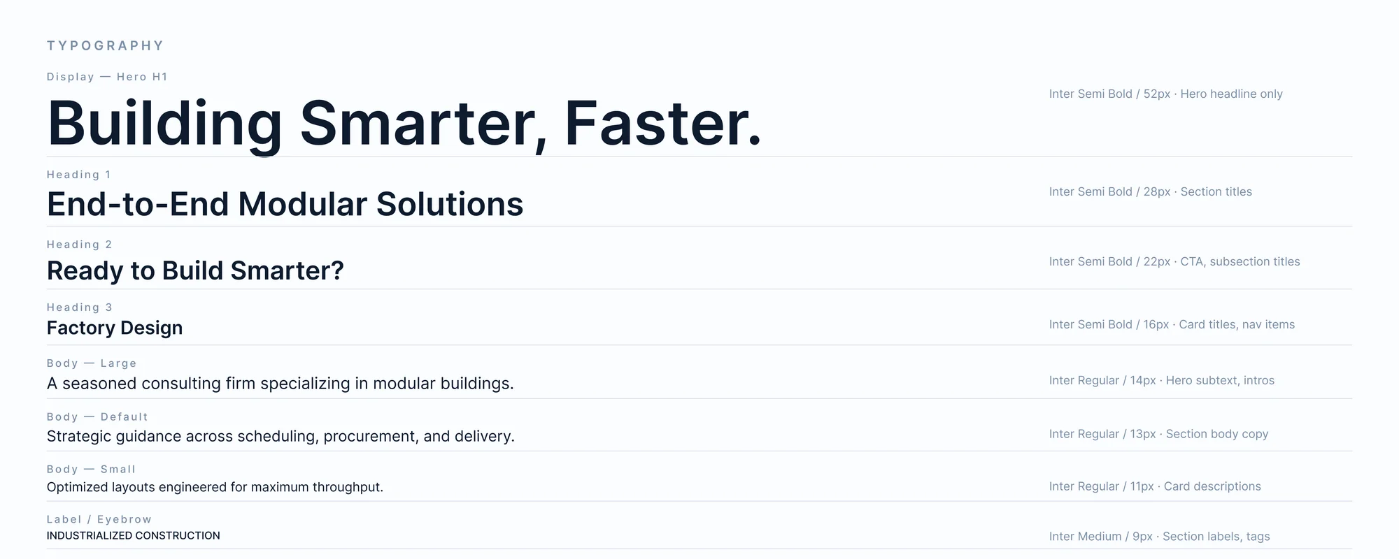
I didn't start with pages; I started with tokens. I defined my colors (deep navies for trust), typography (Inter for clarity), and an 8px spacing grid directly in Figma.
This made the development process much smoother. When the client sent content updates midway through, I didn't have to redesign anything — I just updated the components.
3. Fixing the Flow
I broke the content into 6 clear pages so each one has a specific job:
- Home: Grabs attention with an interactive 3D model and quick stats.
- Services: A deep dive into their 5-step process.
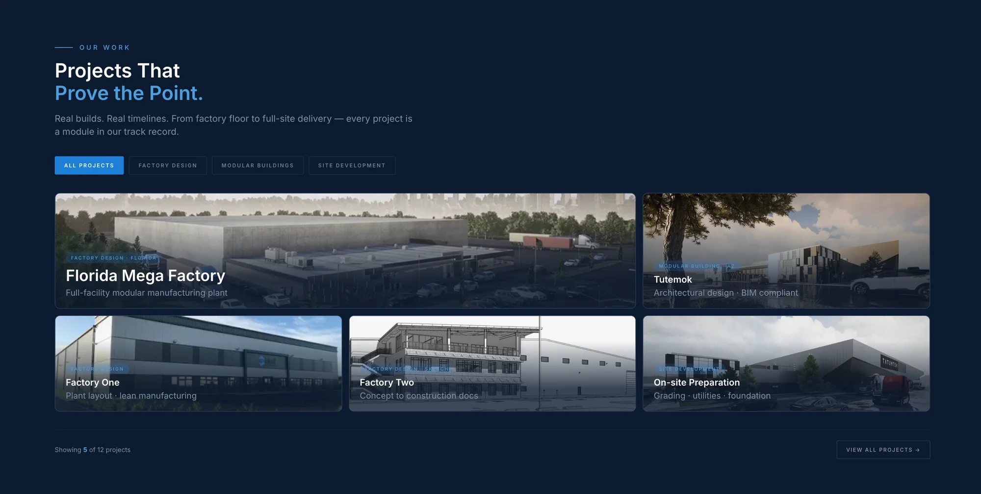
- Projects: I turned the "Factory Design" section into a real portfolio. It now shows proof of their work with a clear layout that's easy to scroll.
- Investors: A brand new page designed to speak directly to capital partners.
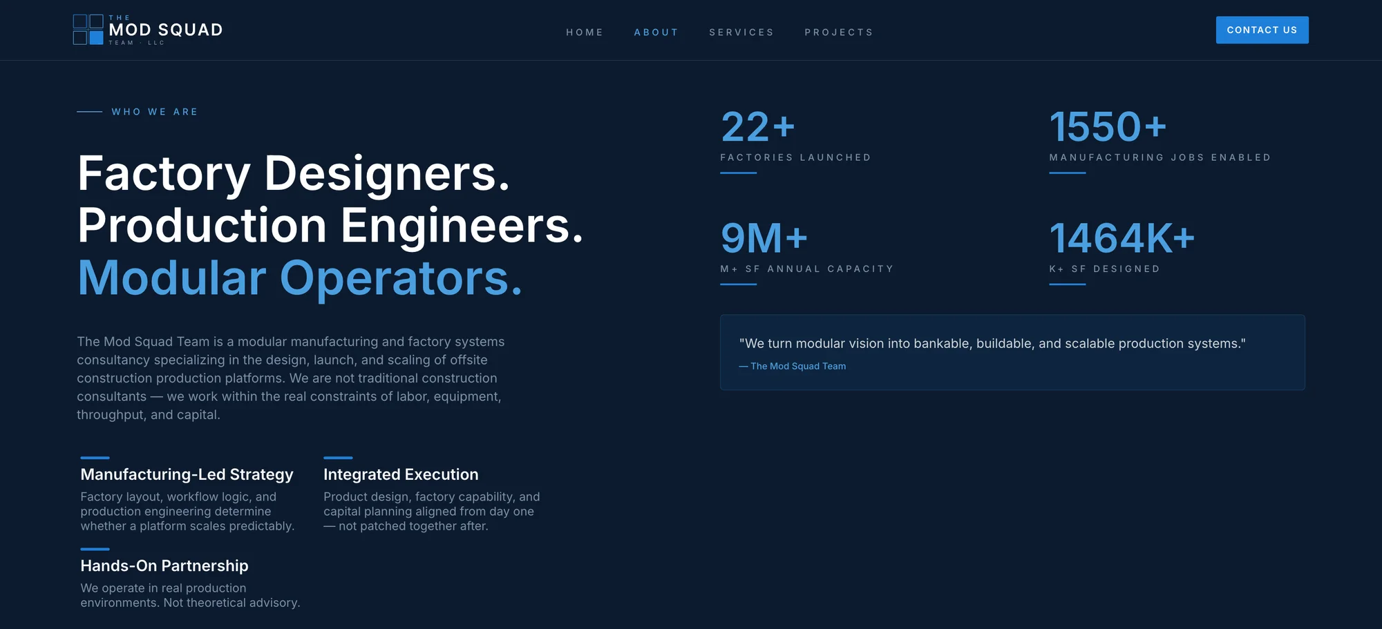
- About: Team bios and company story, with a proper Meet the Team section.
- Contact: A two-column layout — form on the left, info card on the right.
4. The Build (Astro + Claude Code)
I used Astro for the development to keep the site fast and lightweight. Using Claude Code as my technical partner, I was able to translate my Figma components into clean code quickly.
I also built custom HTML email signatures and business cards with QR codes, making sure the brand felt the same whether you were looking at an email or a printed card.
Results
- Clarity: It's now easy to tell what they do and see the factories they've actually built.
- Scalable: The site is built with a component mindset, so adding new projects in the future is simple.
- Professional: The brand finally matches the scale of their work.