The Problem
An independent artist has to be a lot of things at once, and a generic page makes all of them harder:
- Many Audiences, One Page: Listeners, venues, event organizers and collaborators all arrive wanting different things.
- Scattered Presence: Songs lived on Spotify, videos on YouTube and photos on Instagram, with no single place that told the whole story.
- A Bilingual Story: My music moves between Colombia and Canada, and the site needed to speak to people in both Spanish and English.
The Goal
The main objective was a site that feels like me and works like a tool: something that makes it easy to listen, easy to follow and easy to book.
- Lead With the Music: Put listening and watching first, with the latest video and Spotify one click away.
- Make Booking Obvious: Show what I offer, upcoming shows and a clear way to get in touch.
- Speak Both Languages: Treat Spanish as a full version of the site, not an afterthought.
- Keep It Editable: Let me update shows, photos and copy myself without touching code.
My Design & Development Process
Brand & Look
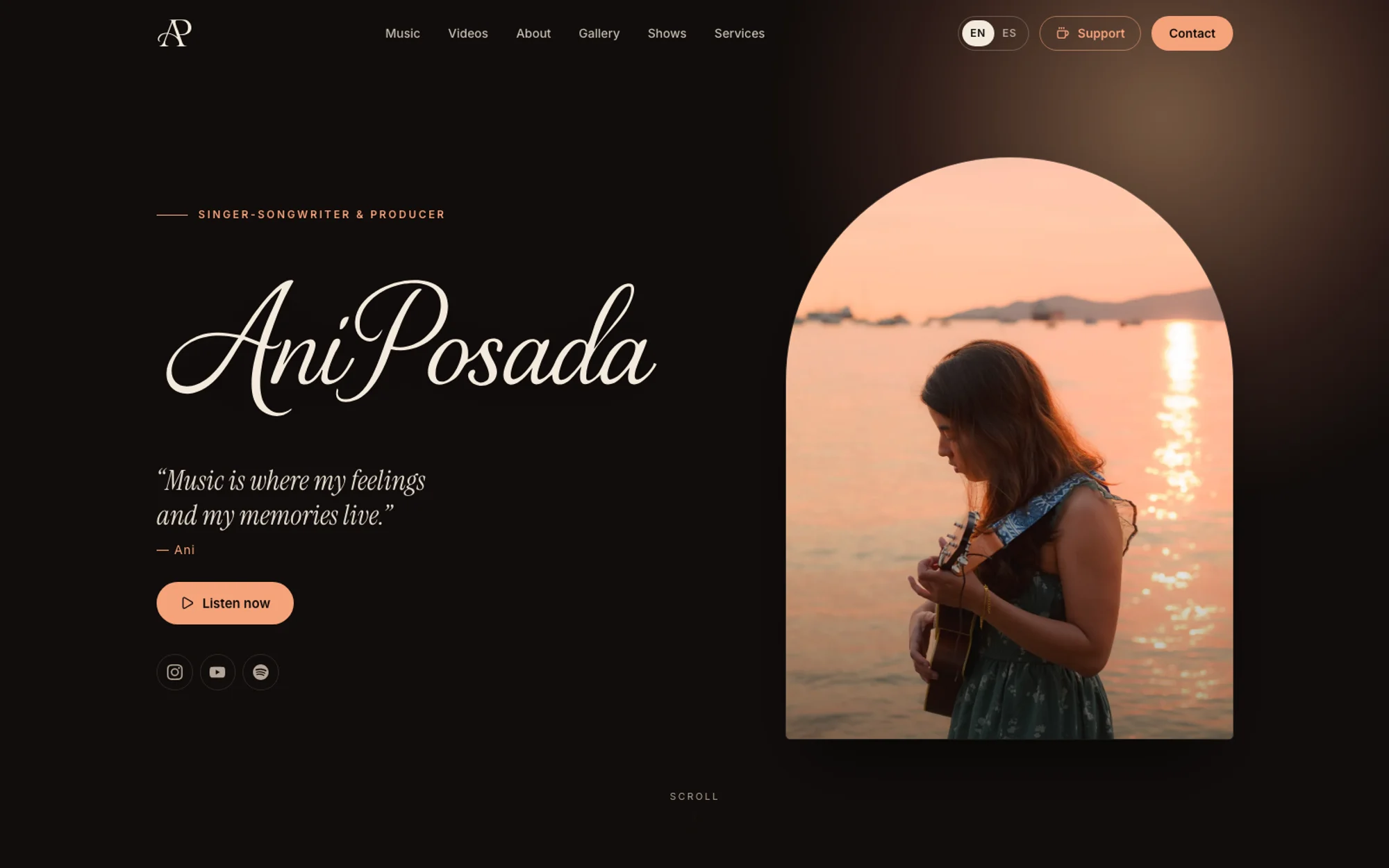
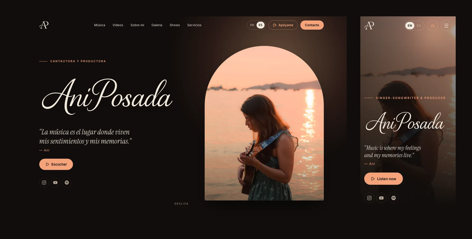
The identity is built around warmth and memory. A dark, candlelit palette lets the photography glow, a flowing script wordmark gives the name a handwritten feel, and an arched photo frame echoes a window or a stage. Serif type carries the quotes and headings, with a clean sans for everything practical.
Structure
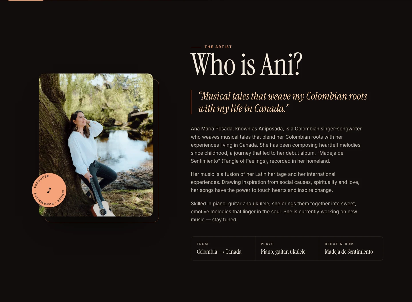
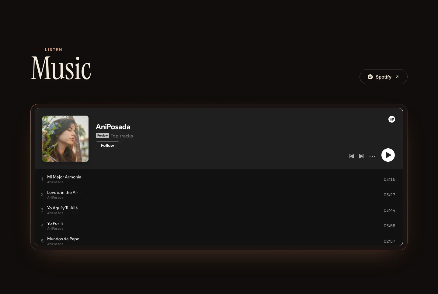
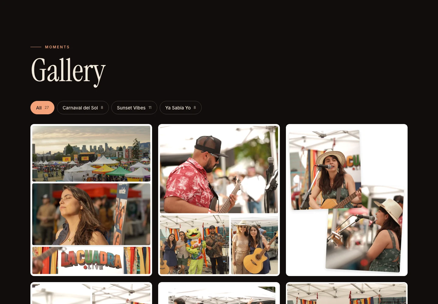
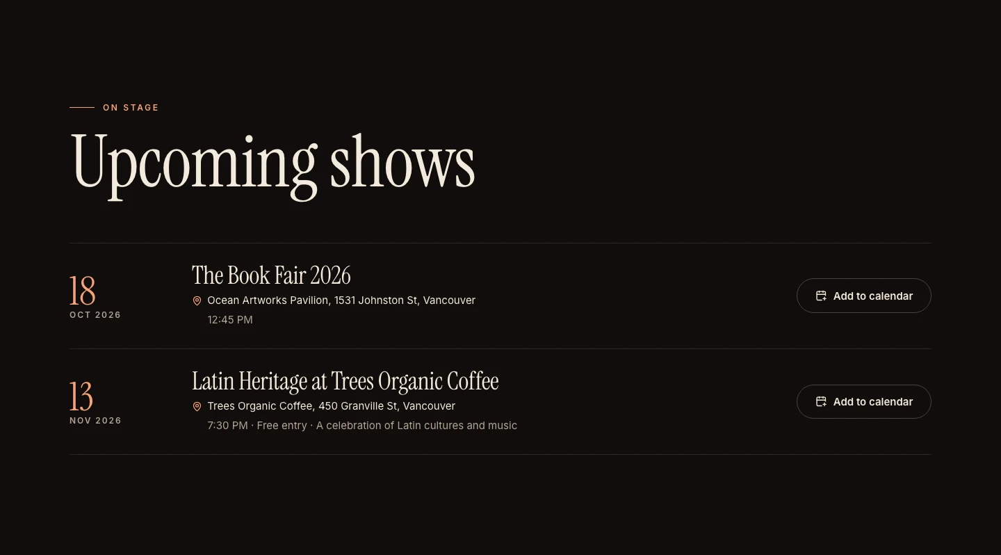
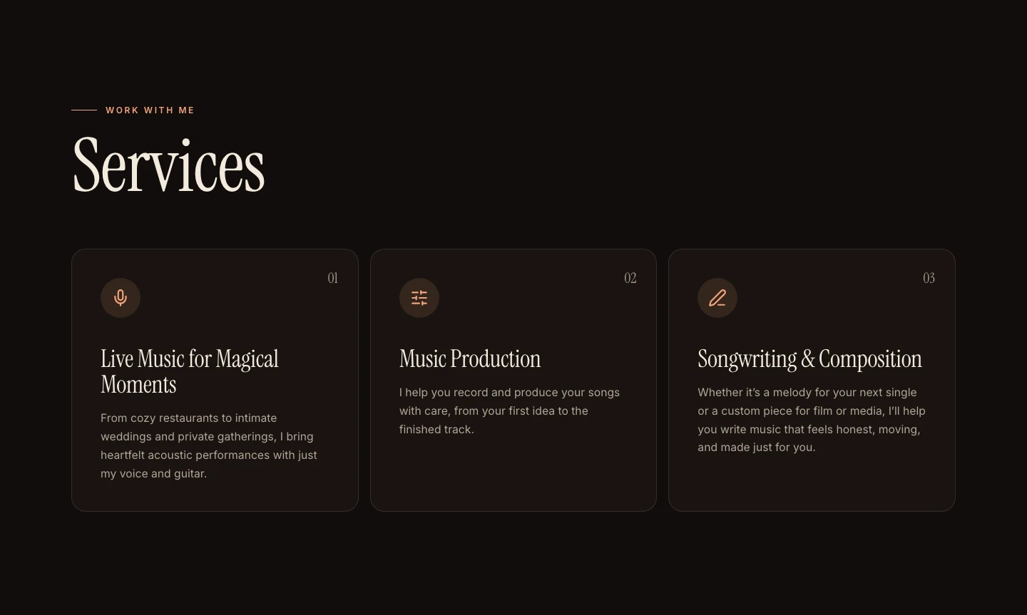
I organized the page around what each visitor needs, in order: listen, watch, learn who I am, browse the gallery, see upcoming shows, check services, support the music, and get in touch. Shows come with add-to-calendar links, and services are described in plain language so a restaurant owner or a couple planning a wedding knows exactly what they can ask for.
Technical Challenge: A Truly Bilingual Site
- The Task: English and Spanish needed to be equal citizens, with their own pages, not a translation bolted on.
- The Result: I built the site in Astro with a dedicated Spanish version, a language toggle in the header, and the language metadata search engines expect, so each audience lands on the right version.
Final Results & Reflection
This project let me bring my two worlds together: the designer and the musician. Building my own site meant every decision came from how I actually want people to experience my music.
- Designing for Feeling: The best choices were the quiet ones: the pace of the page, the photography, and a single serif voice for the words that matter.
- One Page, Many Visitors: Ordering the sections around what each audience needs made the site simple to scan without feeling like a form.
- Owning the Stack: Managing the content through a CMS means I can add a show or a photo in minutes, which keeps the site current.